This is a backlog task for problems with the Dark Mode feature.
Issues
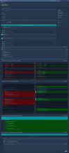
| Fixed? | Description | Picture | PHUI Tag | Revision |
|---|---|---|---|---|
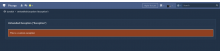
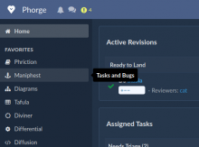
| ✅ | Project hovercard title and desc are unreadable |  | .phui-header-shell | |
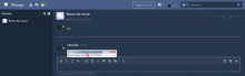
| 🕐 | Links with poor contrast |  | D25491 | |
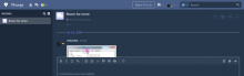
| 🕐 | Links are blue over blue |  | D25491 | |
| ❌ |  | |||
| ❌ |  | |||
| ❌ |  | |||
| ❌ |  | |||
| ❌ |  | |||
| ❌ | T15056#12892: Dashboard panel linear gradient |  | .phui-oi-tail | |
| ❌ |  | |||
| ❌ |  | |||
| ❌ | Poor contrast between text and background, clashes with the design in any task with many comments |  | .phui-timeline-older-transactions-are-hidden | |
| ❌ |  | |||
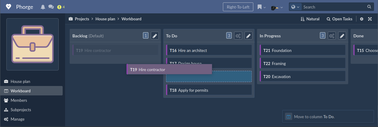
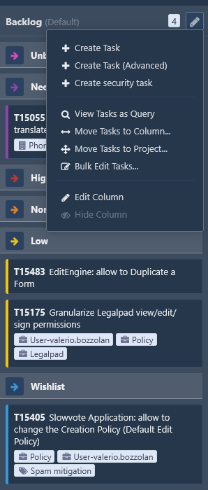
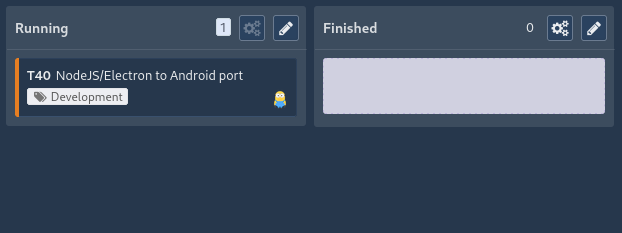
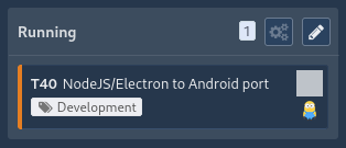
| ❌ | Workboards with a custom color background: unreadable column menus |  | phuix-dropdown-menu | |
Fixed Issues

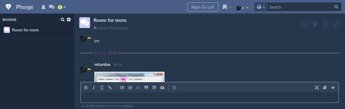
- Conpherence: date/timestamp is hard to read:
- Fixed as
- Fixed as
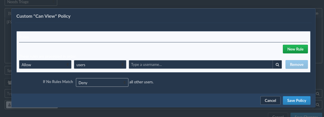
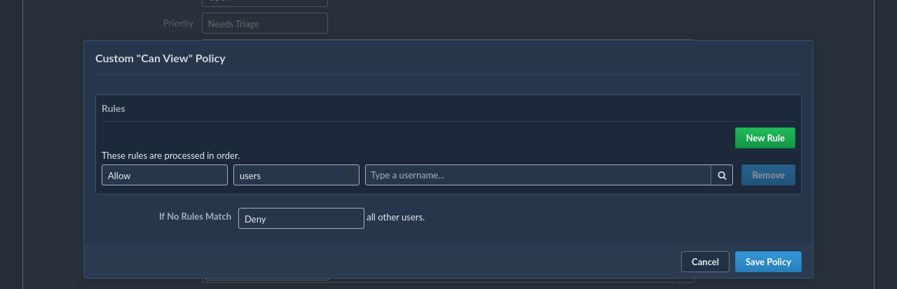
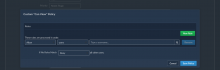
- Custom policy editor:

- Fixed as
- Fixed as
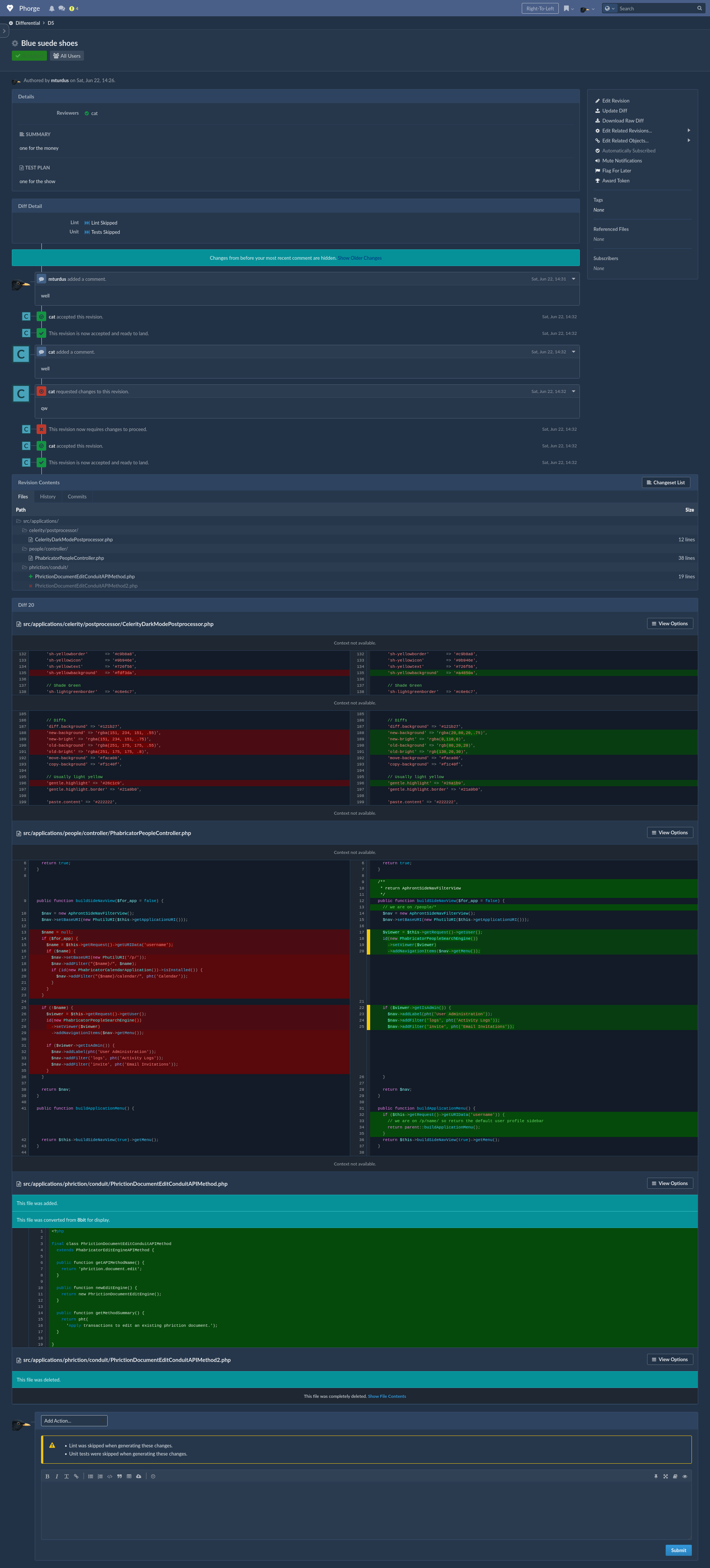
- Differential:
- Fixed as
- Fixed as
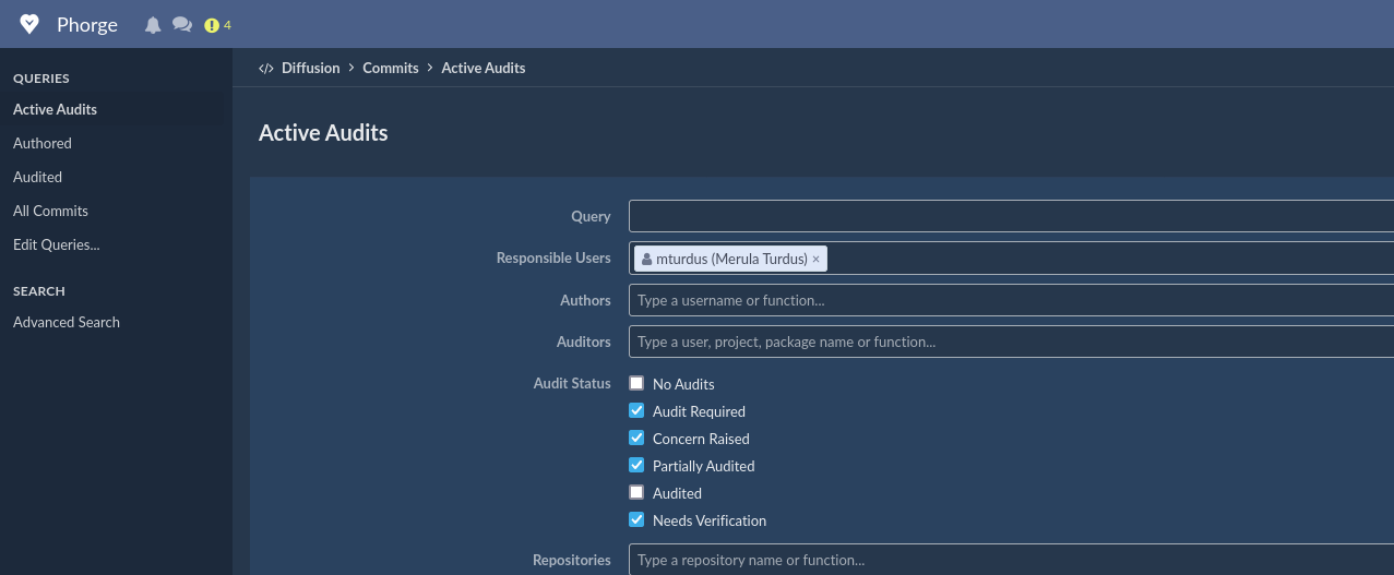
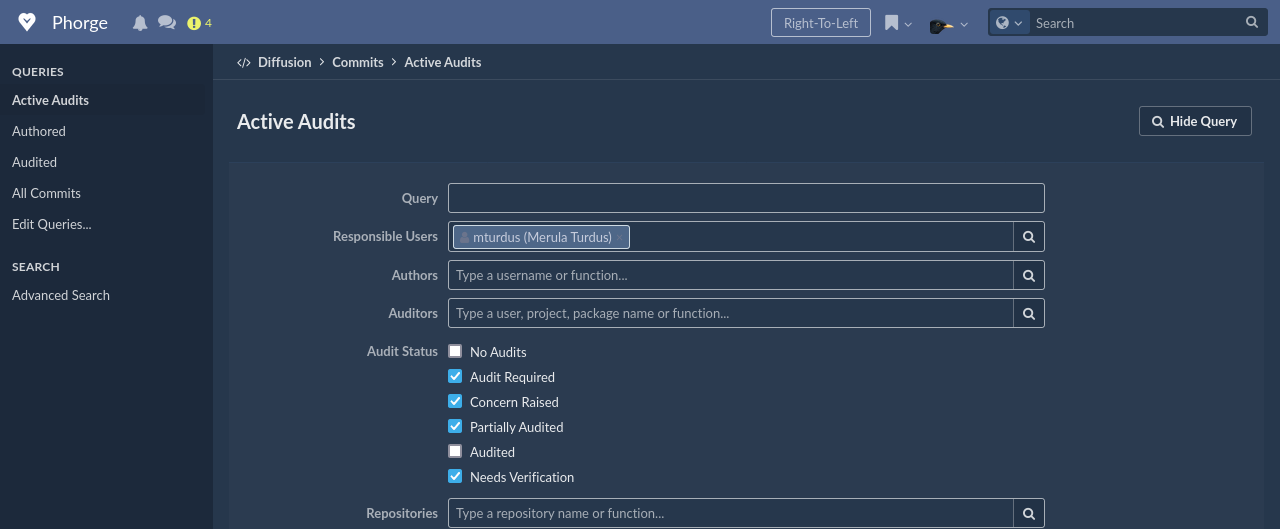
- Background in Diffusion Active commits is different then in other screens:
- Fixed as

- Fixed as
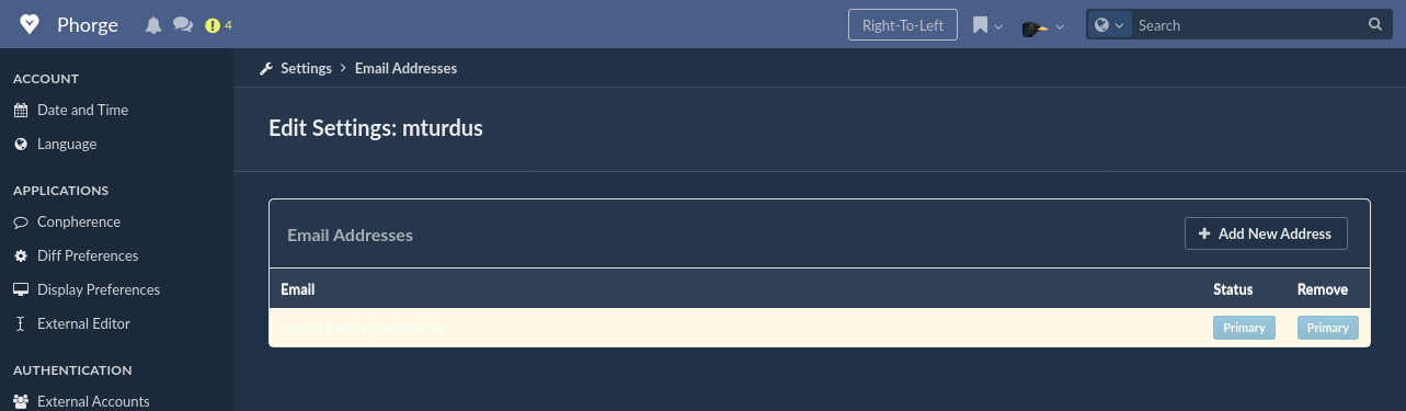
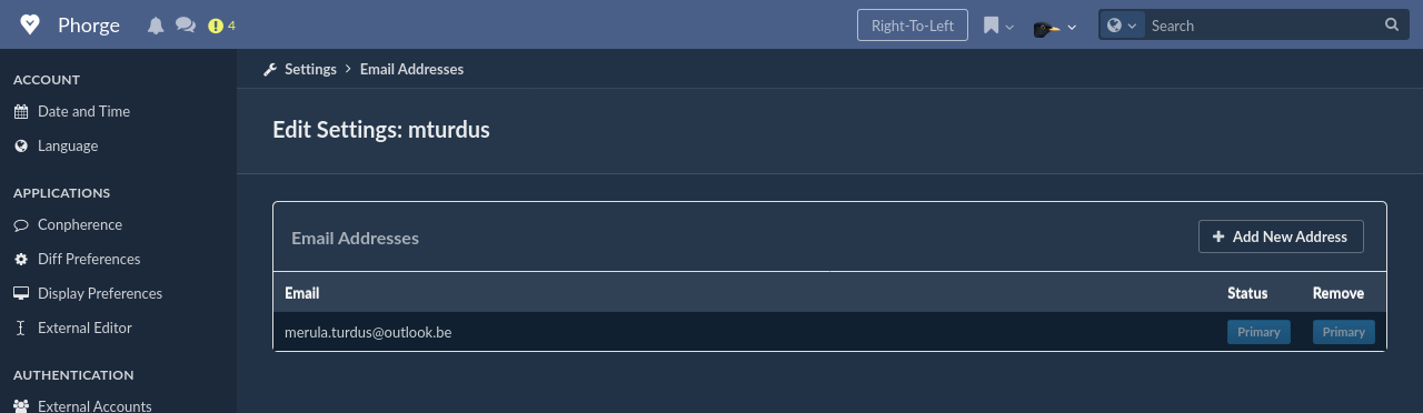
- Email settings:
- Fixed as

- Fixed as
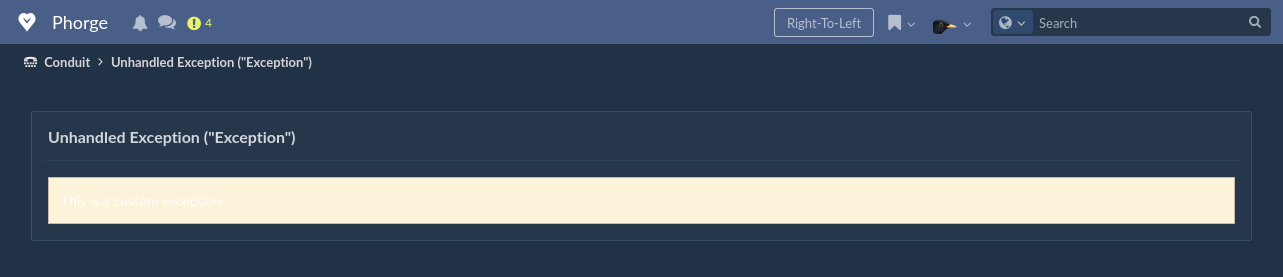
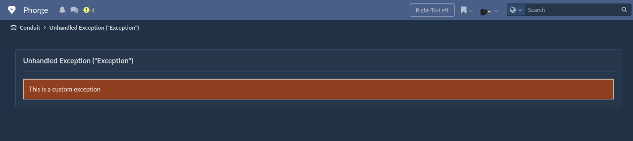
- Exception logging:
- Fixed as
- Fixed as
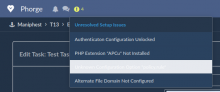
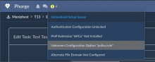
- Setup issues menu:
- Fixed as
- Fixed as
- Navigation menu selection/hovering:
- Fixed as
- Fixed as
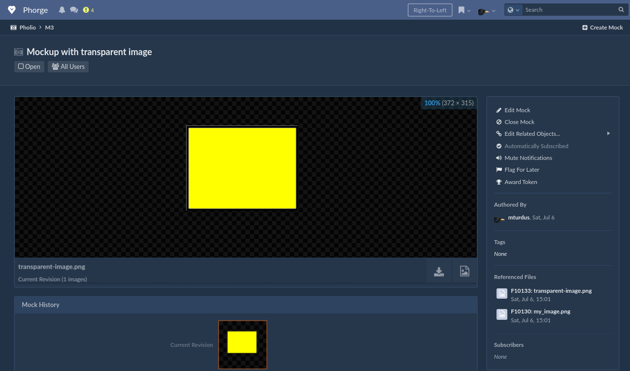
- Pholio with transparent images:
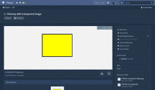
- Fixed as
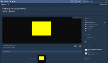
- Fixed as
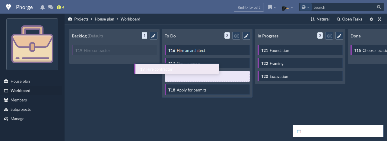
- Project workboards:

- Fixed as

- Fixed as