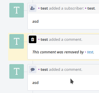
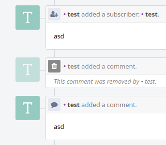
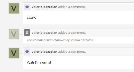
This small restyle makes any Removed Comment a little less
prominent than normal ones, with the goal of decreasing a
bit your in-page distractions and increase your individual
productivity in your business by at least 250 milliseconds
every 48 hours of hard work in front of your monitor.
| Before | After |
|---|---|
This implementation (which is called "Kasper on Diet")
contains these specific changes for Removed Comments:
- user icon visibility: reduced by ~50% (-> Kasper)
- black "trash" icon: reduced by ~50% (-> Diet)
- texts: visibility reduced by ~50%
- vertical padding: reduced from 16px down to 4px
Note that if your Phorge is under the Serious Business Mode,
it seems it is still technically possible to manually
activate the "Decaying Curse" proposal mentioned in the Task.
Closes T15192


