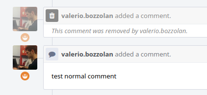
When a comment is removed, it is somehow even more visually prominent than all the other normal comments.
Current situation
See that the removed comment is rendered just as any other usual comment - but - (apart from the fact that the body is in italic - and that is great, since I'm Italian) see that there is a very visible " Trash" icon on the left, with black background and white text - that makes the row even more prominent from the others.
I have not scientific proofs for that, but you see, that removed comment is like a black garbage can in a white room full of marble artworks. Probably, as soon as you enter that art gallery, your eyes trigger their focus on the garbage can instantly, even before noticing the nearby marble artworks.
Proposal 1: "Kasper on Diet"
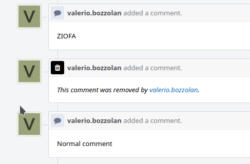
We can make them a bit less visually impactful, in this way:
- deleted comments could demand less vertical margin
- deleted comments could be somewhat semi-transparent
Proof of concept:
As you can see from the above image, the above comment is not too much hidden. It's not in ninja mode too. It is just in a compromise state, still visible, but much less prominent. The user icon is in semi-transparency. The trash icon is not of a sparkling bright black anymore. The vertical padding was reduced too.
Proposed CSS:
.phui-timeline-shell-removed .phui-timeline-icon-fill,
.phui-timeline-shell-removed .phui-timeline-image {
  opacity: 0.5;
}
.phui-timeline-shell-removed,
.phui-timeline-shell-removed a,
.phui-timeline-shell-removed .phui-timeline-title {
  color: rgba(0, 0, 0, 0.5);
}
.phui-timeline-shell-removed .phui-timeline-core-content {
  padding:4px 16px !important;
}
Proposal 2: Decaying Curse
Preamble: Why we should try to "hide a bit" a removed comment, when we can light it up like a princess instead. Here the proposal:
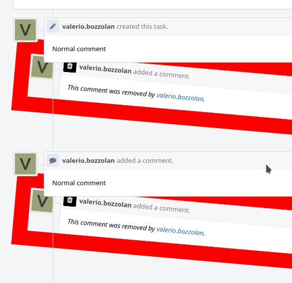
.phui-timeline-shell-removed {
  border: 30px solid red;
  transform: rotate(5deg);
  position:relative;
  z-index:-10;
}
Proposal 3: Liberating the Kraken
(Still needing 12 hours of work to finish this - sorry)
Proposal 4: ...
...
Feel free to add another proposal or discuss the current ones and share your ideas!