Page MenuHomePhorge

Fix Fonts
Open, HighPublic

Assigned To
None
Authored By
avivey
Aug 31 2023, 08:22
Tags
None
Referenced Files
F1348413: image.png
Feb 8 2024, 08:24
F1348375: image.png
Feb 8 2024, 08:06
F1348365: Atkinson-Hyperlegible.png
Feb 8 2024, 08:01
F1342102: Lato.png
Feb 7 2024, 17:33
F1342100: Inter.png
Feb 7 2024, 17:33
F1342098: Open-Sans.png
Feb 7 2024, 17:33
F1342094: Noto-Sans.png
Feb 7 2024, 17:33
F1342035: Recursive-Sans-Linear.png
Feb 7 2024, 16:56

Description

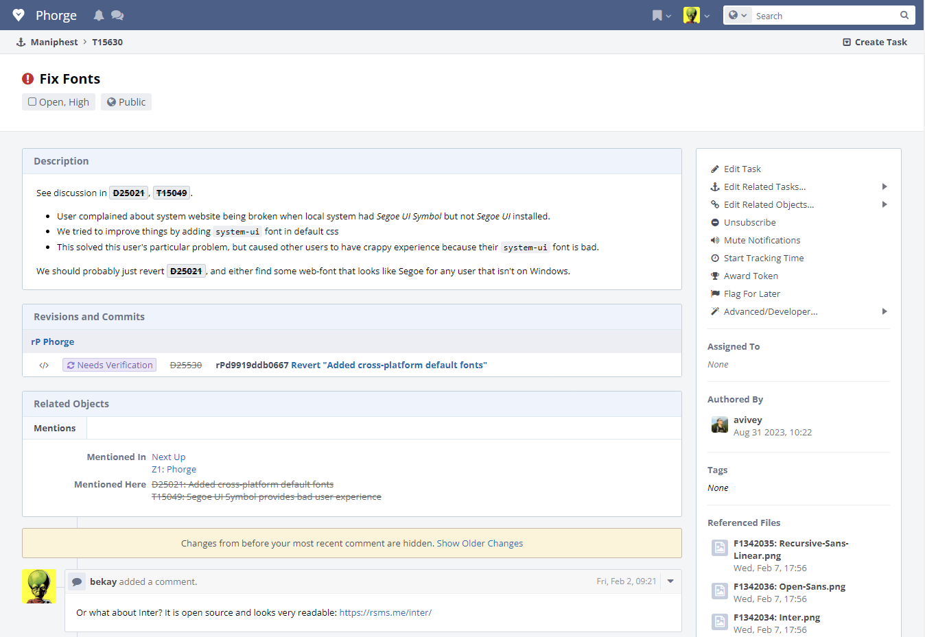
See discussion in D25021, T15049.

  • User complained about system website being broken when local system had Segoe UI Symbol but not Segoe UI installed.
  • We tried to improve things by adding system-ui font in default css
  • This solved this user's particular problem, but caused other users to have crappy experience because their system-ui font is bad.

We should probably just revert D25021, and either find some web-font that looks like Segoe for any user that isn't on Windows.

Revisions and Commits

Event Timeline

avivey triaged this task as High priority.Aug 31 2023, 08:22
avivey created this task.

Did some digging, and it looks like Segoe is not something we can use:

https://learn.microsoft.com/en-us/typography/fonts/font-faq#redistribution-and-extended-rights

No, as Segoe UI is both our user interface and corporate branding font, it is not available for use outside of Microsoft products on non-Windows platforms. However, we do have a Segoe-compatible open-source font you can use: Selawik.

I did find in on CDNFonts, but that looks like it's missing most weights - and I think we would still not be allowed to bundle/refer to it.

It's also a little bit common to install it on Linux systems - I found plenty of instructions for that, so 🤷‍♀️.

Anyway, MS do offer a "Segoe-compatible open-source font" - Selawik, which was released in 2015 and never updated again, and I understand we can use that one as a webfont or package it ourselves, and then use it as a fallback for Segoe UI.

The new font family styles does look not very nice on macOS, look at the bold texts...

Screenshot 2024-01-24 at 13.59.50.png (191×411 px, 26 KB)

How about Noto Sans or Open Sans? These are modern and nice alternatives... https://similarfont.io/2-google-fonts-similar-to-segoe-ui

Downloadable here: https://gwfh.mranftl.com/fonts

Or what about Inter? It is open source and looks very readable: https://rsms.me/inter/

Noto seems like a reasonable choice. I personally really like DejaVu Sans a lot.

I think Noto Sans looks more "normal" than inter
Another good one is Lato

cf a very similar discussion about default fonts in GNOME at https://gitlab.gnome.org/GNOME/gsettings-desktop-schemas/-/issues/52 regarding aspects to take into consideration

Interesting that gnome is considering Inter. Recursive looks really good too. I like that it has both monospace and proportional all in one.

Regardless of the choice made here; I'm likely going to maintain a patch on my instance that uses Inter for headings and UI elements, and Atkinson Hyperlegible for long-form text prose content.

Maybe I should create a slowvote poll to reach a decision?

I like the first three the most.

Lato

Lato.png (76×972 px, 10 KB)

Noto Sans

Noto-Sans.png (83×1 px, 11 KB)

Inter

Inter.png (87×957 px, 10 KB)

Open Sans

Open-Sans.png (83×1 px, 11 KB)

Recursive Sans Linear

Recursive-Sans-Linear.png (79×1 px, 11 KB)

Atkinson Hyperlegible

Atkinson-Hyperlegible.png (77×991 px, 10 KB)

Here you can see the fonts with Phorge itself. For me the clear winner is Noto Sans. It can add some real modern style to the site.

  • Noto Sans:
    Noto-Sans.png (929×1 px, 139 KB)
  • Open Sans:
    Open-Sans.png (929×1 px, 83 KB)
  • Inter:
    Inter.png (929×1 px, 139 KB)
  • Lato:
    Lato.png (929×1 px, 128 KB)
  • Atkinson Hyperlegible:
    image.png (929×1 px, 159 KB)

Of these, I like 1 and 3 (Noto and Inter) better. How does Atkinson look? (I haven't gotten around to changing the font on my end yet, heh)

Of these, I like 1 and 3 (Noto and Inter) better. How does Atkinson look? (I haven't gotten around to changing the font on my end yet, heh)

I have updatet my comments. With 13px font size (as is on Phorge) it really does not look good IMO.

And on another note: Times have changed and we all have very big screens. I think we should increase the default font size of 13px to 14px. It is about time...

Noto Sans, bigger font-size, very good look:

image.png (923×1 px, 243 KB)

In T15630#15561, @bekay wrote:

Times have changed and we all have very big screens.

Absolutely not. Maybe in some richer countries to some extent, but not on my mobile phone. (And even if that was true, scaling exists for a reason.)

In T15630#15561, @bekay wrote:

Times have changed and we all have very big screens.

Absolutely not. Maybe in some richer countries to some extent, but not on my mobile phone. (And even if that was true, scaling exists for a reason.)

I beg to differ. We should go with the time. 13px is on every screen too small and an artifact of an era of a desktop resolution of 1024px. We could always target mobile screens to set a smaller font size - but even so, the default case for working with this site is not mobile.

If we want to attract new people this site should not look like some page from a bygone era... in the end I am talking only of a bump of 1px 😉

I am honestly happy that you have the privilege to afford getting bigger screens. Unfortunately not everyone has. The point I'm trying to make is: There may be valid + good reasons to increase font sizes, absolutely. However, "go with the time" and "times have changed" phrases are neither valid reasons nor argumentations. :)

I am honestly surprised by the notion, the user base of phorge is still using old, small or low resolution screens. I always thought this project was catered towards tech-savvy devs and/or corporations and will be used in contexts where a FullHD screen is the default case. Maybe we should sharpen our target audience 😅

Still: Noto Sans with 13 pixels?

I configure my browsers to increase the default font size because my eyes can’t handle the small fonts. Most pages tend to size appropriately but there are some oddities, including Phorge. I’ll grab some screen caps when I’m back on workstation.

CSS is rather flexible now; a larger font scale can be specified for displays above a certain horizontal resolution or display width/effective character width, nowadays.
Atkinson looks poor at the font size specified, you're right about that @bekay.
I feel like it might need to break out into another task item, but perhaps CSS modernization is imo a good step towards making Phorge more compatible and capable, on screens both small and large.

As far as fonts are concerned, while we should decide on a new default font, should this be a configurable? Should we make an item (in Config for defaults, and in Settings for users' choice) to change the UI font on an installation?

Also, is it a concern that we increase the users' initial request size by including a font asset? It would be cached, of course, but it's still more to send down the wire.
I presume that a coherent and stable font display is more important than the cost of a few KB of fonts, though.

As far as fonts are concerned, while we should decide on a new default font, should this be a configurable? Should we make an item (in Config for defaults, and in Settings for users' choice) to change the UI font on an installation?

I'd prefer to see the fonts to be configurable; I'd rather impose certain CJK fonts rather than relying on OS defaults or hope for client having that correct font available client-side....

As far as fonts are concerned, while we should decide on a new default font, should this be a configurable? Should we make an item (in Config for defaults, and in Settings for users' choice) to change the UI font on an installation?

See https://secure.phabricator.com/T8227.

The way towards configuration here is probably allowing extensions to provide Themes - similar to the "Accessibility" selection in the Display Preferences (https://secure.phabricator.com/T4213).

CSS is rather flexible now; a larger font scale can be specified for displays above a certain horizontal resolution or display width/effective character width, nowadays.
Atkinson looks poor at the font size specified, you're right about that @bekay.
I feel like it might need to break out into another task item, but perhaps CSS modernization is imo a good step towards making Phorge more compatible and capable, on screens both small and large.

I agree with CSS modernization, that is definitely a project worthy of some effort. It's also probably a lot of work and fraught with potential for collateral damage and regressions. Nonetheless I think it's worth discussion. We should break that out into a new task.

As far as fonts are concerned, while we should decide on a new default font, should this be a configurable? Should we make an item (in Config for defaults, and in Settings for users' choice) to change the UI font on an installation?

I would support this idea. There is already a user preference for monospace fonts in text areas, which doesn't seem to actually work for me, though I remember that it used to work a long time ago.

Also, is it a concern that we increase the users' initial request size by including a font asset? It would be cached, of course, but it's still more to send down the wire.
I presume that a coherent and stable font display is more important than the cost of a few KB of fonts, though.

It's pretty hard to come up with a consistent typeface across all platforms without supplying a web font resource. "font stacks" are the old-school way to achieve this from time before browsers supported custom fonts. https://www.cssfontstack.com/ is a resource for that.

On the extreme end of configurability we could allow each user to provide their preferred font face. I have no idea if that could be done in a reasonably secure manner.

From my perspective, on Linux, Phorge already supports configurable fonts - that is, none of the specific typefaces mentioned in the phorge css actually work, so it falls back to whatever I set as the default document font in Gnome.

Broader CSS discussion: T15734

Now: Do we want to use a modern webfont as the default font family?

For consideration of the bigger picture, I'd like to mention https://collinmbarrett.com/block-web-fonts (performance etc) and for example Firefox 118+ blocking font fingerprinting in private windows (yes, private only, but I can vaguely imagine expansion).

Inter and Noto look best to me (1080p laptop screen, Linux, Firefox, no scaling) given all default sizings in Phorge (as a drop-in replacement). Noto, I believe has a lot more Unicode symbol coverage, and a larger file size as a result; but Inter has variable font properties (e.g., more weights than "bold" and "regular", as well as condensed and expanded forms, letter variants for differentiating I/l O/0, etc).

Regardless of our choice here, we should maintain sane fallbacks (and test them) on the major platforms, in the event that web fonts are blocked or otherwise won't load. Last in the chain would be sans-serif, and then we work north from there towards our chosen webfont.

For consideration of the bigger picture, I'd like to mention https://collinmbarrett.com/block-web-fonts (performance etc) and for example Firefox 118+ blocking font fingerprinting in private windows (yes, private only, but I can vaguely imagine expansion).

Of course we would host the web font from the rsrc folder. That would diminish many of the problems. We would only need the normal and bold font weight (with the italic variants), so the bandwidth hit too would be considerable less. But again, maybe I come from another world, but most of the criticism in that article seems absurdly outdated in my view. Not an argument, just my personal opinion.

As far as bold/italic variants are concerned, for fonts that support it, you can preferentially serve the "variable" version and only fall back on specific font variants when that isn't supported, to save on bandwidth in most cases - since the e.g., Inter Variable font file "includes" the bold and italic, condensed and expanded versions, essentially "for free", as they're generated by the font engine/renderer on the fly from the base font.

The support table for variable fonts covers Chrome since 67, Edge since 17, Firefox since 62, and most mobile browsers.

We should pack the fonts internally, not use an external source.
We pack all the assets we use, for cases where network access is limited by infosec types or by other reasons.
Just serving few font files from the site would be much simpler, and the extra bandwidth requirements are miniscule anyway.

I don't know if we need to explicitly set a fallback font - I'd expect the system to do that anyway, if it can't use any specified font.

Agreed. We should not link fonts from outside our own assets (those hosted on an instance of Phorge.) I don't think I suggested that, but I don't disagree.

We should have an explicit chain of fallbacks in CSS, as the system fallback font mechanism is often plagued with issues (Linux fontconfig has been painful in the past to web browsers.)
The sans-serif or system-ui at the end of the chain tells the browser that, if the fonts that were selected prior (in left to right order) in the CSS declaration are all missing, that it should use the browser's specified sans-serif text font, or the system font (the actual "default" default, without this selected, is a serif font, Times New Roman or similar usually.)

For instance, this is the font stack, or fallback chain, in the CSS on cohost.org:
font-family: Atkinson Hyperlegible, ui-sans-serif, system-ui, -apple-system, BlinkMacSystemFont, "Segoe UI", Roboto, "Helvetica Neue", Arial, "Noto Sans", sans-serif, "Apple Color Emoji", "Segoe UI Emoji", "Segoe UI Symbol", "Noto Color Emoji";
It doesn't mean it includes all of these fonts on the website, or even links to them - only that the first font in the list that resolves to a character on the screen, will be used.

Also, note the emoji font selections at the end, after sans-serif. As far as I understand it, this ensures the precedence of available emoji fonts in that order, prefers color emoji over monochrome (the default in some browsers/environments) and that things like Segoe UI Emoji or Segoe UI Symbol wont override the system UI fonts. Quotes around multi-word font names is also important, to prevent substring parsing (e.g., Segoe UI may match Segoe UI Symbol, but "Segoe UI" shouldn't.