Page MenuHomePhorge

Workboard: have thin scrollbars
ClosedPublic

Authored by matmarex on Jun 22 2023, 11:56.

Details

Summary

The original intention was to hugely improve the UX interaction on Workboards for Microsoft Windows
users, since they have BIG GIANT SCROLLBARS. So we adopted thin scrollbars, that are graphically
pleasant for all other "normal" browsers too.

Note that this can be really thin now. The premise is: probably you will never notice this, since
you never try to click on the scrollbar.

In case, if you have problems, contact us. But note:

  • you can use the mouse wheel as usual
  • you can use keyboard navigation (try the tab key - it auto-scrolls!)
  • you can use usual touch movements on relevant devices.

The non-standard CSS version is kept for compatibility.

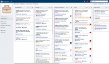
Scrollbar examples in Microsoft Windows with Chromium-based browser:

BeforeAfter
Screenshot 2023-06-20 at 07-27-41 Editing-team (Kanban Board) · Workboard.png (2×3 px, 759 KB)
Screenshot 2023-06-20 at 07-32-20 Editing-team (Kanban Board) · Workboard.png (2×3 px, 774 KB)

Scrollbar examples in GNU/Linux with KDE, on mouse hover:

BeforeAfter
BEFORE_bar_hover.png (859×585 px, 150 KB)
AFTER_bar_hover.png (859×585 px, 150 KB)

... on bar selected:

BeforeAfter
BEFORE_bar_selected.png (859×585 px, 149 KB)
AFTER_bar_selected.png (859×585 px, 150 KB)

Ref T15488

Test Plan

View a Workboard and a Differential side panel
on Firefox with static scrollbars enabled.

Diff Detail

Repository
rP Phorge
Lint
Lint Not Applicable
Unit
Tests Not Applicable

Event Timeline

Thanks :) Have you the possibility to use Arcanist and re-submit the patch?

arc patch D25305

arc diff --update D25305

In this way we should receive your commit email, and also trigger tests.

Otherwise, feel free to just share your email here and I will amend for you

I couldn't get it to work (I was missing some dependency for the lint checks), but maybe I'll put in some more effort and try again.

valerio.bozzolan edited the test plan for this revision. (Show Details)

run tests

Waiting to see this reviewed by others with more experience, have you the possibility to somehow make the CSS comments shorter, to make the linter happy? :)

For that, feel also free to propose an alternative CSS comment, just as a comment here, and I can try to help to integrate for you

The lines are so long that Harbormaster Target 1182 has explosed with this PHSTATUS: LINT_LINE_TOO_LONG.
I expect this revision not to provoke concerns from people.
The PHSTATUS above is not real.

Sorry this took me a while to get back to. I was distracted at first, and then it turned out that the lints don't work at all on Windows. (I got them working; I'll file another bug and submit a patch for that.)

Premising that I never manually "use" the scrollbar: I always use the mouse roll on desktop, or the finger swipe on mobile.

Premising that I agree that this HUGELY improves the situation on Microsoft Windows, looking at your screenshots,

I have to say that:

I tried to manually "use the scrollbar" after this change. It seems, it is now probably too much thin on Linux desktop and I have honestly some difficulties in using the mouse pointer to "pick that damn cute small scrollbar" so I just use the mouse wheel / touch gestures. Do you feel the same?

It seems these potential concerns are somehow known:

https://developer.mozilla.org/en-US/docs/Web/CSS/scrollbar-width#accessibility_concerns
Use this property with caution — setting scrollbar-width to thin or none can make content hard or impossible to scroll if the author does not provide an alternative scrolling mechanism. While swiping gestures or mouse wheels can enable scrolling on such content, some devices have no scroll alternative.
WCAG criterion 2.1.1 (Keyboard) has been in place for a long time to advise on basic keyboard accessibility, and this should include scrolling of content areas. And introduced in WCAG 2.1, criterion 2.5.5 (Target Size) advises that touch targets should be at least 44px in width and height (although the problem is compounded on high-resolution screens; thorough testing is advised).

But, interestingly, PHORGE SUPPORTS KEY NAVIGATION \o/ The user can use the tab to go anywhere and it auto-scrolls things. Interesting!

So, I would say: we have no accessibility concerns here. I think nobody in the world manually track and click a scrollbar in 2023 and we use mouse wheel and touch things instead.

So we can think about scrollbars as "visual indicators" for Workboards. Most read-only, if you accept this nonsense description from me.

So:

I like this change since it has big Microsoft Windows browser improvement. And, let's wait for feedback: we can rollback this anytime.

For example, we can activate this rule only on Microsoft Windows, in case, if we receive some concerns from other systems.

lgtm

This revision is now accepted and ready to land.Aug 2 2023, 17:05
valerio.bozzolan retitled this revision from Use standard CSS properties for thin scrollbars to Workboard: have thin scrollbars.Aug 2 2023, 17:16
valerio.bozzolan edited the summary of this revision. (Show Details)

Can you share a nice A/B test on Microsoft Windows to upload?

webroot/rsrc/css/phui/workboards/phui-workboard.css
24

What about having .device-desktop as parent here?

Can you share a nice A/B test on Microsoft Windows to upload?

I see you've found them.

webroot/rsrc/css/phui/workboards/phui-workboard.css
24

I thought that there was some reason why it wasn't used. I can add it though.

matmarex marked an inline comment as done.

Added .device-desktop to some selectors as requested

Forgot the celerity thing

webroot/rsrc/css/phui/workboards/phui-workboard.css
31

Why it was necessary to prefix this with .device-desktop?

36

Why it was necessary to prefix this with .device-desktop?

matmarex added inline comments.
webroot/rsrc/css/phui/workboards/phui-workboard.css
31

Because you asked me to prefix the rule I was adding, and this needs to stay the same, otherwise the scrollbars will behave differently on Firefox and Chrome.

I don't care if .device-desktop is used or not, I can remove it if you changed your mind, but it should be the same for the scrollbar-width stuff and the webkit-scrollbar stuff.

For faster review I would like to try to explain better to others why it was necessary to change so many selectors to change the Workboards scrollbar, but I'm not 100% sure about .phui-flank-view-body and the shadow thing.

For faster review feel free to explain this, also just by adding cute inline comments here and there in Differential.

webroot/rsrc/css/phui/workboards/phui-workboard.css
31

Just as clarification, indeed my comment was just about this specific situation:

https://we.phorge.it/D25305?id=1200#inline-2609

I will kindly resign since I'm terrible at frontend :) Others: please help here

This revision now requires review to proceed.Aug 19 2023, 03:48

Restored the previous selectors, added some code comments to try to explain better why I wrote them this way. I hope this clarifies things. Thanks!

OK so if I understand correctly:

  • .device-desktop .phui-workpanel-body-content is the vertical scrollbar
  • .phui-workboard-view-shadow is the horizontal scrollbar

So I'm only confused about .phui-flank-view-body

webroot/rsrc/css/phui/phui-formation-view.css
150–152

Can you help me in understanding what is .phui-flank-view-fixed .phui-flank-view-body about?

This selector does not match anything in my console on a normal Workboard :(

matmarex added inline comments.
webroot/rsrc/css/phui/phui-formation-view.css
150–152

It's actually in Differential, not on workboards. It's the sidebar with the list of files. You need either a ton of files changed, or a very small browser window to get a scrollbar there:

image.png (599×3 px, 183 KB)

I guess this is still waiting for someone to review it, and not for me to "land" it?

webroot/rsrc/css/phui/phui-formation-view.css
150–152

(I cannot see file F337632 - probably need to tune its View permissions)

matmarex added inline comments.
webroot/rsrc/css/phui/phui-formation-view.css
150–152

Fixed

lgtm

Sorry for waiting.

If somebody does not like this, maybe we can just restore and add a global UX preference, to make Microsoft Windows users happier :D

This revision is now accepted and ready to land.Jul 10 2024, 08:33

Oh, I have to land it… Let's see if I still remember how.

This revision was automatically updated to reflect the committed changes.

I had to rebase and rebuild resources/celerity/map.php to fix a merge conflict. I hope that worked.