Page MenuHomePhorge

Ponder Answer Comments: indent textarea as Comments
ClosedPublic

Authored by valerio.bozzolan on May 4 2023, 21:34.
Tags
None
Referenced Files
Unknown Object (File)
Wed, Apr 17, 06:09
Unknown Object (File)
Sat, Apr 13, 20:39
Unknown Object (File)
Sat, Apr 13, 20:33
Unknown Object (File)
Sat, Apr 13, 19:52
Unknown Object (File)
Sat, Apr 13, 19:45
Unknown Object (File)
Sat, Apr 13, 19:27
Unknown Object (File)
Sat, Apr 13, 18:33
Unknown Object (File)
Sat, Apr 13, 18:04

Details

Summary

In a Ponder Answer, when adding a Comment, the textarea indentation was a
a little bit unintuitive.

After this change, the textarea is aligned as a Comment:

BeforeAfter
Ponder - Before.png (694×626 px, 45 KB)
Ponder - After.png (694×626 px, 48 KB)

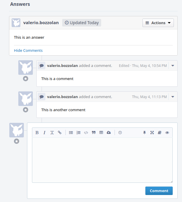
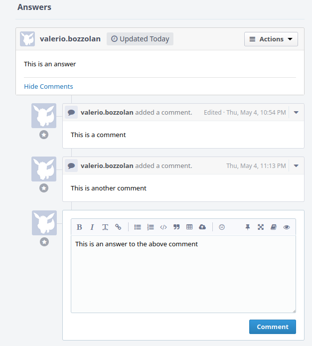
Other changes are welcome but this seems to me a good minimum.

I also hope this could help not to confuse the Comment field with the Answer field.

Closes T15350

Test Plan
  • create a Ponder Question
  • create an Answer
  • look at the Comments input field that now should be more nicely indented
  • the normal Response field is not changed at all
  • the mobile view is not changed at all
  • click on "Pin Form On Screen" and it must be as before

Diff Detail

Repository
rP Phorge
Lint
Lint Not Applicable
Unit
Tests Not Applicable

Event Timeline

webroot/rsrc/css/application/ponder/ponder-view.css
56

Note: I used the .phui-box.phui-comment-form-view selector instead of just .phui-comment-form-view, so that it's more specific, and it overrides the precedent value.

This was my elegant workaround to avoid a CSS !important otherwise necessary.

This revision is now accepted and ready to land.Jul 17 2023, 06:48
webroot/rsrc/css/application/ponder/ponder-view.css
56

↑ My inline comment is not relevant anymore, since we have the :not() selector that is already incidentally more-precise.

So there is no need to have margin-left: 94px; !important.