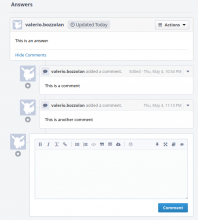
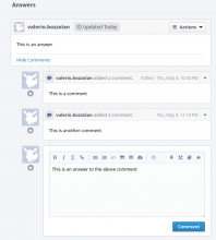
In a Ponder Answer, when adding a Comment, we can maybe improve a bit how the input field is aligned.
Clarification and proposal:
| Before | Proposed |
|---|---|
See that, in the proposed version, the input box is aligned just like the comment itself.
I also hope this could help not to confuse a Comment with the Answer field.

