Page MenuHomePhorge

Allow collapsing/expanding workboard column content by clicking its header
ClosedPublic

Authored by aklapper on May 27 2024, 21:37.

Details

Summary

Reduce users' need for scrolling on smaller screens with 920px or less viewport width by using HTML5's <details>/<summary> so clicking on a workboard column header hides the content of that column, in all CSS views (mobile, tablet, desktop). Keep expanding its content by default.

On mobile and tablet devices, display an arrow in the column header box below the header text to potentially make those users aware of this functionality that benefit the most from it. Do not render these arrows on desktop devices (though the collapse/expand functionality still works there).

See https://caniuse.com/details for browser (in)compatibility.

Closes T15843

Test Plan

Go to a project workboard with several columns and tasks in them on a screen with 920px or less width. See a small arrow below the column header text. Click on a column header to collapse and expand the column content.

Diff Detail

Repository
rP Phorge
Lint
Lint Not Applicable
Unit
Tests Not Applicable

Event Timeline

Obviously this is very WIP (but still works).

For example, I have no idea how not to apply this functionality to desktop view.

Also, what happens in an ancient browser? https://caniuse.com/details

Very cool!

Not sure if we prefer to make isCollabsable a property of the base classes, instead of making them non-final - we have a lot of these kinds of properties going around. 🤷‍♂️

For ancient browsers, IIRC, the fallback is just to show both parts without the "details" section being collapsible. Curios to see how this renders though - is the toggle button pretty? Can it be customized?

There are 2 places where we differentiate "small screen" - most things happen just with CSS, but there's something that happens in the PHP code - I think Home has that (It used to only show the menu), and possibly Differential Revision page. I think there's no JS element that triggers on load and checks for width, but I could be wrong.
Naturally, stuff that happens in PHP isn't "responsive" for dynamically changing the viewport size.
But I also don't think it's that important not to enable this on Desktop? Assuming the default state is "open".

Not sure if we prefer to make isCollabsable a property of the base classes, instead of making them non-final

Uhm, very good point. Yes! I obviously forgot everything about object oriented programming from many years ago. :-/

Add PHPDoc for setCollapsible

Display custom collapse/expand arrows only on mobile screens; display them after the column header name instead of before

Avoid non-ASCII bytes in CSS by using FontAwesome

IMHO this is ready to review.

Only issue remaining is backwards compatibility for browsers not understanding <summary> and <details>. https://stackoverflow.com/questions/22644268/details-and-summary-tag-compatibility-issues was not too useful either.

See https://caniuse.com/details - YMMV but I'd say I do not want to care too much about folks still using IE11, Firefox 48, Chrome 11, Edge 18, Android browser 3, Safari 5.1, or Opera Mini.

aklapper edited the test plan for this revision. (Show Details)

Use consistent class scope; fix a typo

Use consistent CSS scopes. Tested. And really really last change for now. I think.

I love this collapsible on mobile since it saves a lot of scrolls, but I think the collapsible on desktop can just add confusion without clear benefits (since the desktop layout is not vertical, and saving vertical space does not help in showing more information). Probably this should only apply on .device-tablet and .device-phone, but not .device-desktop

I love this collapsible on mobile since it saves a lot of scrolls, but I think the collapsible on desktop can just add confusion without clear benefits (since the desktop layout is not vertical, and saving vertical space does not help in showing more information). Probably this should only apply on .device-tablet and .device-phone, but not .device-desktop

I agree but don't know how to do that. .device-* is CSS. <details> and <summary> are HTML elements.
How to influence those elements' given behavior (or even replace them with <div>s) based on CSS? :)

To have this a bit more flexible we should probably toggle visibility by JavaScript. (So, we can keep divs, and this makes the change also a bit more backward compatible probably)

A bit like traditional Wikipedia's collapsibles are implemented. Just with divs and JavaScript togglers.

Probably we already have something, like toggle-widget? or anyway creating something similar.

https://we.phorge.it/source/phorge/browse/master/webroot/rsrc/js/application/conpherence/behavior-toggle-widget.js

we should probably toggle visibility by JavaScript

I personally don't enjoy the idea of writing and maintaining custom JS to mimic functionality provided by standard HTML (and I think such JS would destroy find-in-page functionality for text in [hidden] task cards).

On desktop, could adding details > summary.phui-header-shell { cursor: pointer; } make this a bit less surprising and more discoverable, maybe?
Could also display the expand/collapse triangle on desktop of course, but I felt like it distracts and steals screen estate for functionality that people do not need to know about when on desktop.

Premising that as web developer I'm really super surprised to have never seen in my life a native <summary> + <detail>, even in demos 🤔 I've never seen it in basic online courses for beginners ( https://www.w3schools.com/howto/howto_js_collapsible.asp ) - and that's surprising since there it would be nice; not in online forums with super-basic "spoiler" features (e.g. https://www.minecraftforum.net/forums/forums/forum-discussion-info/514283-how-do-i-make-spoilers-on-the-forum ) and there it would be nice, not in Bootstrap and not in MaterializeCSS (and it would be nice to have examples there to save some JavaScript); not in MediaWiki (because there, "esoteric" tags are disabled; so, since the beginning, every single wiki in the planet has 10 lines of JavaScript in their Common.js), etc.

I mean, I'm surprised and I appreciate that browsers are able to do that, but I would appreciate to discover 1 famous project that relies on this (apart from 1 StackOverflow answer from 2021 that has 1 upvote atm); since it seems to me normal to do this little thing with reliable JavaScript code. Really.

Premising that this is one of the core features of Phorge (unrelated but it adds additional scary emotions to me - ihih);

I'm inclined to think that the <summary> and <detail> are a bit esoteric and, most importantly, really not enough flexible (e.g. if somebody proposes to avoid this on desktop, and if it's too complicated with this native approach, that's a good example of something that probably already creates a little additional burden for future logics).

I really think that it would really be better to add a little cute bit of sparkling magic JavaScript here, just because we can.

I don't want to add extra work, but...

Look at the JavaScript example in T15870 :D isn't that relaxing, calming, and increasing apparent human control? 🦄

About the cursor: pointer;, yep it would be super-nice, but no need to create distinctions between mobile and desktop for that probably 🤔 let's always show it.

Uh, it would also be implicit adopting a "traditional" <a> tag instead of <summary> 🐵 🐵 🐵 with just a little bit of JavaScr... OK OK I already said this ihih

are a bit esoteric

I prefer decisions based on technology support ("our product shall support browser versions / platforms back to year X"), not popularity ("nobody uses it so let's not use it so nobody uses it").

most importantly, really not enough flexible (e.g. if somebody proposes to avoid this on desktop

As this is not a software architecture decision with potential future impact, I'd say if someone needed more flexibility in the future then they are welcome to (re)implement things the way they prefer.
I'm not against a JS implementation of this functionality though - I just don't plan to write it. :)

Set cursor: pointer in CSS

Apply phone style also to tablet style because same rendering (only one column)

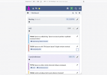
Screenshots of {desktop, tablet, phone} width, exposing an arrow only on tablet and phone as we previously made people scroll large distances anyway and to increase discoverability of the feature in these viewports:

Screenshot from 2024-07-01 14-57-15.png (882×1 px, 189 KB)

Screenshot from 2024-07-01 14-57-34.png (882×1 px, 88 KB)

Screenshot from 2024-07-01 14-57-45.png (882×1 px, 85 KB)

I'm really impressed. Tested and it's super-nice, with implicit middle fingers pointed to JavaScript.

Please wait for another +1 before merging, or at least a couple of weeks, to attract testers with real browser-webs.

My concern is that some browsers have unexpected additional styles on these tags. But hey, "it works on my computer" and "it works on the paper".

This revision is now accepted and ready to land.Jul 1 2024, 13:05