This is kind of a followup to T15645. I have looked again at the UX of using diffusion and why I am so confused by it. Now I have figured it out. There are two views:
- the repo home view, example: https://we.phorge.it/source/phorge/repository/master/
- the browse view, example: https://we.phorge.it/source/phorge/browse/master/
These views share some components (the rendered contents of the root folder, Readme), but differ in some important ways (Clone, Actions and Branch buttons for example can only be found in the repo view). But both views will be rendered under the active Code tab and that is the source of many confusing click odysseys...

I think we could improve the UX
- by adding a new tab button like "Home" (Repo? Start?) for the repo home view.
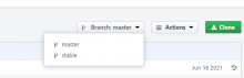
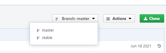
- by staying in this home view when switching branch like this