Page MenuHomePhorge

Typehead results of main search should not truncate important information
Closed, ResolvedPublic

Description

A typeahead result set of the main search on our instance can look like this:

image.png (340×366 px, 25 KB)

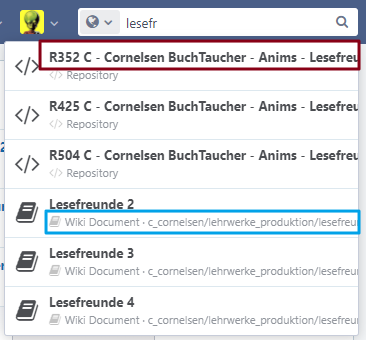
As you can see: The red part should not be truncated, because it can contain important context to discern the results. The blue part should be truncated in a correct way with an ellipsis.

With some very small css changes it could look like this:

image.png (383×359 px, 25 KB)

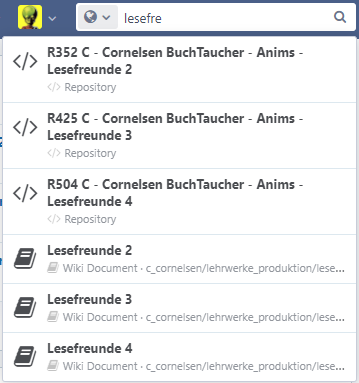
Do you think that is better?

Event Timeline

I guess you could get the result that you're looking for by editing the file webroot/rsrc/css/aphront/typeahead.css and removing the line white-space: nowrap; from the definition of div.jx-typeahead-results a.jx-result. I just don't know which side effects this may have in other places...

I guess you could get the result that you're looking for by editing the file webroot/rsrc/css/aphront/typeahead.css and removing the line white-space: nowrap; from the definition of div.jx-typeahead-results a.jx-result. I just don't know which side effects this may have in other places...

My fix would work with this css class: https://we.phorge.it/source/phorge/browse/master/webroot/rsrc/css/application/base/main-menu-view.css$298

It is pretty safe to say, that these styles are only meant for the main menu and will have no side effects. The fix is fast implemented, just wanted to know: Is the reasoning behind this sound?

My fix would work with this css class

I did not realize you had a fix. Please share it. :)

BTW I like the proposed screenshot. So I also agree to: feel free to share the solution 👍

bekay triaged this task as Normal priority.