Page MenuHomePhorge

Colorized Workboards: Increase contrast of menus (increase opacity)
Closed, ResolvedPublic

Description

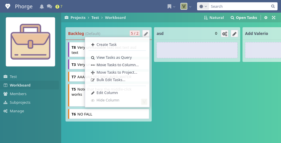
A friend of mine noticed that, if your Workboard has a background color, the contrast of the menu is not enough (opacity 0.9):

Phabricator too much transparency.png (499×978 px, 109 KB)

Some of you may not have any problem with that, but some other users may have some difficulties in distinguishing the text of the menu, and the text of the below Column.

Maybe a good compromise is opacity 0.95:

Phabricator enough transparency.png (499×978 px, 109 KB)

This is the current CSS rule:

.phui-workboard-color .phuix-dropdown-menu {
  background-color: rgba({$alphawhite},.9);

 }

https://we.phorge.it/source/phorge/browse/master/webroot/rsrc/css/phui/workboards/phui-workboard-color.css


It seems this opacity change was introduced in 2016:

https://secure.phabricator.com/D15269

https://secure.phabricator.com/rPc1f57605ab341b04417a0b28a2db9c92385a8a73
Related Objects

Event Timeline

valerio.bozzolan triaged this task as Low priority.
valerio.bozzolan created this object in space S1 Public.
valerio.bozzolan renamed this task from Colorized Workboards: Increase contrast of menus to Colorized Workboards: Increase contrast of menus (increase opacity).Mar 23 2023, 17:55
valerio.bozzolan updated the task description. (Show Details)