this is mostly relevant when working on phorge itself:
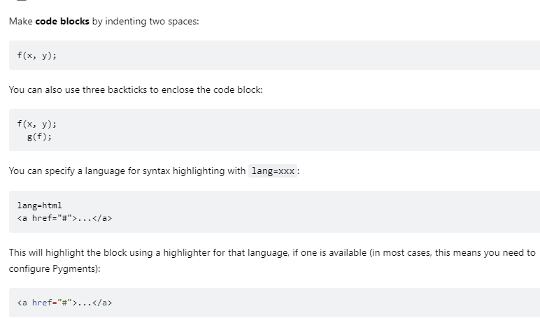
See for example this image:
Since it's a screenshot from here, it's hard to see where the screenshot ends the the current document resumes.
adding border=true option would make this easier to read.
Sidenote - Mac screenshots have a border added by default, and it looks like the minimized version of the same image gets one too:

