Details
At the moment, the wiki page hierarchy is located at the bottom, after the page text, which is not very convenient, since you need to scroll through the page to the very bottom.
Maybe it's worth moving this hierarchy to the side, as well as making it possible to reveal and hide sub-levels to any depth, so that it's easier to find the right page in the hierarchy?
Thanks for a wonderful product.
Event Timeline
Hej hej and welcome! I'm afraid I cannot really follow... In my understanding the hierarchy is expressed via the breadcrumbs navigation right below the top bar and not at the bottom, at least for a screen width of 513px and more?
For example if I go to https://we.phorge.it/w/changelog/next_up/ , see the Phriction > Welcome to the Phorge Wiki > Change Log > Next Up breadcrumbs.
Also, this cannot Affects-Wikimedia as phabricator.wikimedia.org does not have the Phriction module enabled.
Good afternoon!
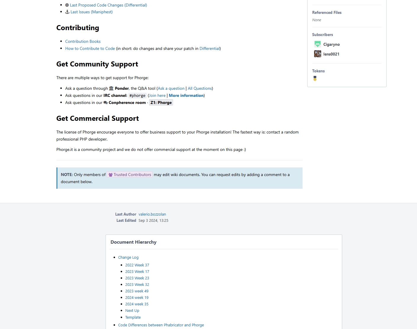
I get it, if you go to Phriction > Welcome to the Forge Wiki, then the hierarchy of documents will be displayed at the bottom (the screenshot below is attached). You won't see this in your example, as there are no attached documents.
I see this on monitors from 19 inches and more.
What you see is 100% normal regardless of your pixel density, display size and resolution.
With a similar approach to T15920, this can be achieved. However, I think there is one disadvantage: text may be crammed with a side hierarchy, resulting in lots of newlines for documents with long titles.
You can create a task now that you are member of Trusted Contributors.
I now realize that this is not about hierarchy (documents below other documents) but about the Table of Contents within a single wiki page? You may want to edit the title.
@aklapper we are talking specifically about documents that are under another document, that is, about the hierarchy of pages in the wiki.
The screenshot F3250825 just shows that the visualization of the document hierarchy is not very convenient in my opinion, and I ask if it can be moved to the side.
Having the wiki's tree of contents on the side would indeed be pretty nice, I gotta say. This is especially the case on the landing pages of a given instance's wiki, at least until it inevitably sprawls to be gigantic ;)
The sublevels of the tree can be made hidden, and they can be revealed when clicking on a specific parent. And if the user expands the tree to a large size, then it is worth limiting the maximum size of the panel and showing a vertical scroll when the maximum is reached.